

Color Psychology In Your Office
You don’t have to be an expert designer or psychologist to curate your office space. The colors adorning our work environment wield an incredible power to shape our emotions, behaviors, and overall productivity. Understanding this dynamic interplay between colors and human psychology is key to curating an office space that fosters creativity, focus, and well-being among employees.
Colors as Emotional Triggers
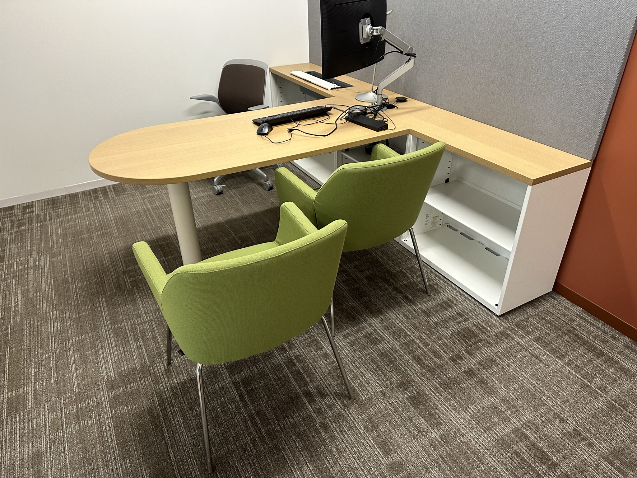
Colors are not just visual stimuli; they are potent triggers for emotions and responses. For instance, the calming hue of blue promotes focus and productivity, making it an ideal choice for areas where concentration is paramount. Meanwhile, the invigorating energy of yellow can stimulate creativity but might be overwhelming in large doses. Green, associated with balance and harmony, can create a serene atmosphere conducive to reducing stress levels and encouraging concentration.
Impact on Mood and Productivity
The color palette chosen for office furniture significantly impacts the mood and productivity of the workspace. Research indicates that employees working in environments with thoughtfully selected colors tend to be more focused, motivated, and less fatigued.
Neutral tones such as beige, gray, or white serve as a versatile backdrop, exuding professionalism while maintaining a sense of simplicity. These tones can complement other vibrant accents while promoting a clean and organized ambiance.
Brand Representation
Colors play a pivotal role in brand representation. Aligning the office furniture colors with the company’s brand identity reinforces brand recognition and consistency. Consistent use of brand colors in the workspace not only strengthens the company’s visual identity but also imparts a cohesive and professional environment.
Aesthetics and Perception of Space
The choice of colors can significantly impact the perceived size and ambiance of a space. Lighter shades create an illusion of openness, making spaces appear larger and airier. On the other hand, darker hues can add warmth and coziness, ideal for creating intimate settings or delineating specific areas within an open floor plan.
Task-Specific Considerations
Different tasks demand different environments. Creative spaces might benefit from vibrant and stimulating colors that encourage out-of-the-box thinking. Conversely, areas requiring intense focus, like meeting rooms or individual workstations, could benefit from calming and subdued color schemes to enhance concentration and productivity.
Lighting and Color Interaction
It’s crucial to consider the interplay between colors and lighting conditions. Natural light and artificial lighting sources can alter the perception of colors, influencing their impact on mood and productivity. A harmonious balance between lighting and furniture colors can create an optimal working environment.
In essence, the amalgamation of colors in office furniture selection is a multidimensional endeavor that transcends mere aesthetics. It involves understanding the emotional and psychological impacts of colors on individuals and harnessing this knowledge to craft workspaces that inspire, invigorate, and promote well-being.
By leveraging the principles of color psychology in office furniture selection, businesses can transform their work environments into vibrant, harmonious spaces that not only reflect their brand but also foster a conducive atmosphere for productivity, creativity, and employee satisfaction.
Quick List
- Blue: Often associated with calmness and productivity. It can help create a serene environment, aiding concentration and focus.
- Green: Linked to feelings of balance and harmony. It’s known to reduce eye strain and create a sense of calmness.
- Yellow: Known for fostering creativity and energy. However, too much yellow might be overwhelming.
- Neutral Tones (such as beige, gray, or white): Often used as a backdrop to promote a sense of cleanliness, simplicity, and professionalism.