
Color isn’t just decoration — it’s a powerful psychological cue that influences mood, behavior, and even productivity. In office design, understanding office color psychology helps you create environments that motivate, calm, inspire, and support your team’s work. Strategic color use in furniture, accent walls, and finishes reinforces your brand identity and enhances overall performance.
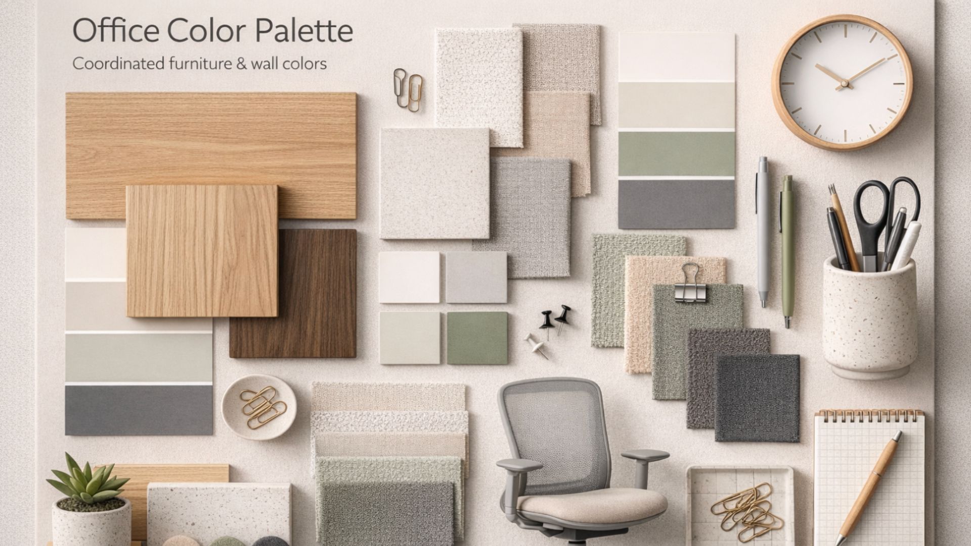
[IMAGE PLACEMENT: Office color palette board showing coordinated furniture and wall colors]
How Color Influences the Brain
Different colors trigger distinct emotional and cognitive responses. For example:
- Blue — promotes calm, focus, and trust
- Green — signals balance and creativity
- Yellow — induces energy and optimism
- Red — increases alertness but can overstimulate
[IMAGE PLACEMENT: Examples of furniture in blue, green, yellow, and red tones in office settings]
Choosing a Primary Palette
Your dominant color should align with your workplace goals. If you want focus and professionalism, blue dominates. If you’re building a creative agency, splashes of green or yellow can stimulate imagination. Use neutrals like gray, white, or beige to ground the space and prevent sensory overload.
Accent Colors and Emotional Impact
Accent colors add energy and break visual monotony. For instance, placing bold chairs or colorful lounge pieces in strategic zones draws people toward collaboration areas or informal meeting spots. Accent color pops also make spaces feel intentional and dynamic.
[IMAGE PLACEMENT: Collaborative zone with colored furnishings drawing attention]
Color and Furniture Placement
Office furniture is a significant visual element — its color influences perception. Light furniture can make small offices feel bigger. Warm tones feel welcoming in reception areas. Dark hues convey professionalism in executive suites. The key is consistency: furniture color choices should align with wall colors, flooring tones, and branding for a cohesive experience.
Adapting Color for Different Zones
You can use color zoning to separate areas without physical barriers. Here’s how:
- Focus areas — calm blues and neutrals
- Creative zones — energizing yellows and greens
- Break rooms — warm, social colors like orange or rich neutrals
[IMAGE PLACEMENT: Floor map with color-coded zones]
Balancing Color With Functionality
Too much color can overwhelm; too little can bore. Balance vibrant accents with neutral backdrops. Match upholstery colors with paint, rugs, and accessories. This creates visual harmony that supports both concentration and creativity.
Brand Integration Through Color
Incorporating your brand colors into office interiors reinforces identity and pride. This can be done through accent furniture, logos embedded in reception areas, or subtle color cues in collaborative zones. When employees see brand consistency in their environment, it enhances connection and loyalty.
Real‑World Examples
Companies that embraced office color psychology saw measurable improvements in team mood and energy. A tech firm introduced soft blue‑gray desks with vibrant green collaboration chairs, supporting both focus and creativity. A law firm used warm neutrals with burgundy accents to convey elegance and trust.
[IMAGE PLACEMENT: Before-and-after image showing color strategy in an office]
Final Takeaway
Color is not superficial — it’s strategic. When you apply office color psychology thoughtfully, your workspace becomes a tool that supports behavior, reinforces culture, and enhances performance. Let your furniture choices not just fill space, but shape experience.
Need help picking colors that work? Contact Cube World USA for a color strategy consultation tied to your business goals.